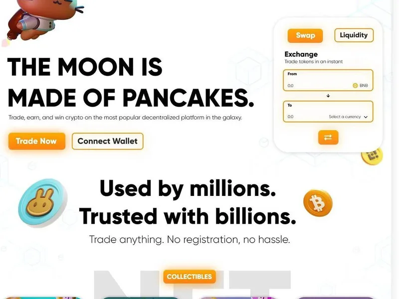
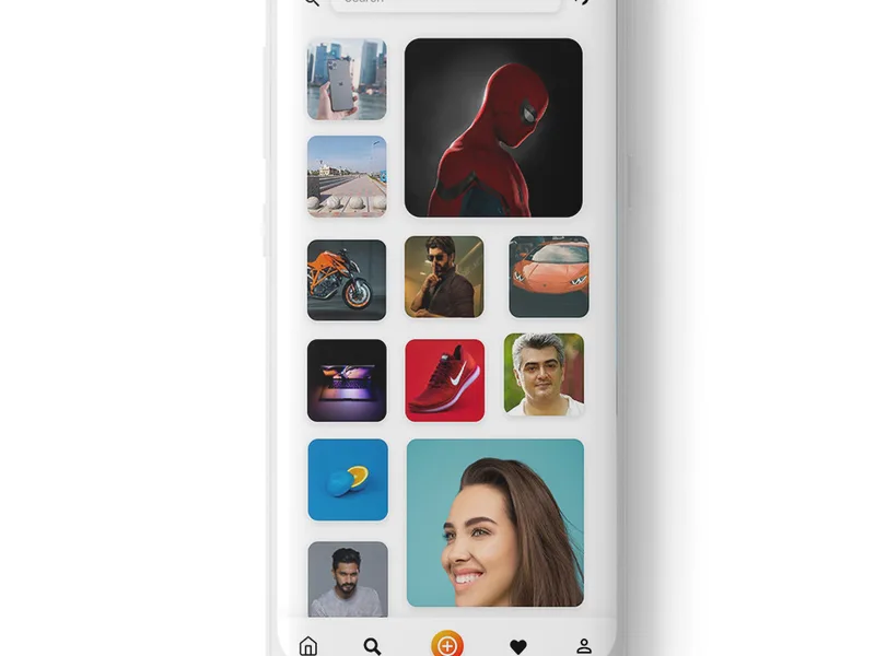
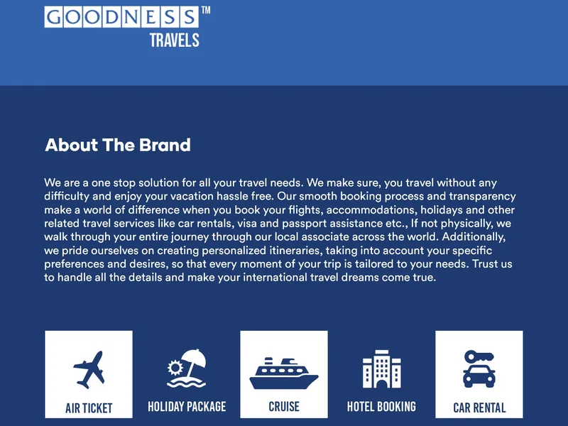
A landing page is a standalone web page built for one purpose: to convert visitors who arrive from a specific marketing campaign. Unlike your homepage, which greets everyone with a broad overview of your brand, a landing page speaks directly to the person who clicked your ad, email, or social post. When done well, a well-optimised landing page turns curious visitors into leads, enquiries, and paying customers with far more consistency than a generic page ever could.
In this guide, we walk through every element that matters, from crafting a headline that earns attention to structuring forms that visitors actually complete. Whether you run paid campaigns on Google and Meta, send regular email newsletters, or need a dedicated page for a product launch, the principles here apply across every channel and every industry.
Landing page versus homepage: why the distinction matters
One of the most common mistakes we see businesses make is sending paid traffic to their homepage. It feels like the obvious choice because it already exists and contains everything a visitor might need. The problem is that a homepage is designed for exploration, not conversion. It has a navigation menu linking to every section of your site, multiple calls-to-action competing for attention, and messaging that tries to appeal to every possible visitor type at once.
A landing page, by contrast, has one job. It removes distractions, strips away unnecessary navigation, and funnels every visitor toward a single, clearly defined action. When someone arrives from a paid search ad offering a free consultation, the landing page repeats that promise in the headline, expands on it in the body copy, and delivers a form that collects the minimum information needed to fulfil it. There is no homepage menu to lure them away, no blog sidebar to divide their attention, and no competing button that dilutes the conversion goal.
The difference in performance between the two approaches can be significant. A homepage typically converts at a much lower rate than a page built around a single offer because it tries to do too many things at once. When every element on the page points toward one outcome, visitors do not have to think about what to do next. They see the offer, understand the value, and complete the action. If you are spending money on paid traffic through channels managed under our paid advertising service or building organic reach through our social media marketing programmes, sending that traffic to a dedicated landing page rather than the homepage is one of the highest-impact changes you can make.
The anatomy of a high-converting landing page
Before diving into individual optimisation tactics, it helps to understand the building blocks. Every effective landing page contains a core set of elements arranged in a deliberate order. Above the fold, the area visible before any scrolling, you will find the headline, a supporting subheadline, a hero visual, and the primary call-to-action button. Below the fold, you typically add a deeper explanation of the offer, key benefits laid out as bullet points, social proof in the form of testimonials or case-study snippets, and the form itself.
The order matters because it follows the natural reading flow. Visitors need to understand what you are offering and why it matters before they are asked to commit any information. Placing the form at the very top of the page, before the value is explained, almost always hurts conversion rates. Equally, burying the call-to-action at the bottom of a long page with no sticky navigation means visitors who decide to convert early have no obvious path to do so.
Writing headlines that stop the scroll
The headline is the single most important element on your landing page. Research on attention spans consistently shows that visitors form a first impression within seconds, and the headline is doing the heavy lifting in that window. A weak headline loses the visitor before they read a single word of body copy.
A strong landing page headline follows a simple formula: it states the core benefit or outcome the visitor will receive, and it does so in plain language without jargon or clever wordplay that requires interpretation. For example, instead of “Unlock Your Business’s Potential,” try something like “Get a Free Website Performance Review, We’ll Show You Exactly What’s Costing You Traffic.” The first version is vague and forgettable. The second version tells the visitor exactly what they are getting and creates curiosity about the result.
Another effective approach is to mirror the language of the ad or email that brought the visitor to the page. If your Google ad says “Free SEO Audit for UK Businesses,” the landing page headline should echo that phrase almost verbatim. This creates continuity between expectation and reality. The visitor clicked because the ad resonated with them, and seeing the same promise repeated on the landing page confirms they are in the right place.
Subheadlines serve a supporting role. They expand on the headline, add a qualifying detail such as a time frame or a specific audience, or introduce a secondary benefit. A good subheadline does not repeat the headline, it adds to it. The headline gets attention. The subheadline deepens interest. Together they should give the visitor enough information to decide whether to keep reading within the first few seconds of arriving on the page.
Body copy that sells without overselling
The body of your landing page has one job: to move the visitor from interest to desire. This is where most pages go wrong by focusing on features instead of benefits. Listing that your software has “real-time analytics” tells the visitor what the product does. Explaining that “you can see exactly where your leads come from and which campaigns are worth scaling” tells them what it means for their business. The difference is the difference between a page that describes and a page that sells.
Every feature you mention should be paired with the specific outcome it delivers. This does not mean you need long paragraphs of text. Bullet points work extremely well on landing pages because they break up dense information and make the page scannable. Visitors rarely read word-for-word. They scan for the parts that matter to them. Bullet points let them do that efficiently while still absorbing the key message.
Objection-handling is another critical function of body copy. The visitor is silently weighing whether to trust you, whether the offer is worth their time, and whether the form is safe to complete. Addressing the most common objections directly in the copy, through a brief section on security, a guarantee, or a note about what happens after they submit the form, removes barriers before they become reasons to abandon the page.
Design choices that reinforce your message
Design on a landing page should serve the copy, not compete with it. Over-designed pages with animated backgrounds, auto-playing videos, and decorative elements often hurt conversion rates because they distract from the core message. The best landing page designs are clean, focused, and use white space deliberately to guide the visitor’s eye toward the headline and call-to-action.
The hero image or video at the top of the page is one of the few design elements that can add significant value. It should illustrate the outcome the visitor is pursuing, a screenshot of a report, a photo of the deliverable, or a short video walkthrough, rather than a generic stock photograph of people smiling at laptops. Authentic, relevant visuals perform better because they feel less like advertising and more like proof.
The call-to-action button deserves particular attention. Its colour should contrast with the page background so it stands out visually, and its copy should describe the action the visitor is taking rather than a vague instruction. “Get My Free Audit” is more compelling than “Submit.” The button should appear above the fold and repeat as a sticky element if the page is long enough that visitors need to scroll. Every repetition is another opportunity to convert a visitor who may have needed time to consider the offer.
The page speed factor: how load times affect conversions
Page speed is not just a technical concern, it directly affects whether visitors stay long enough to convert. A page that takes more than a few seconds to load will lose a significant portion of its visitors before they see the headline, let alone the call-to-action. This is especially true for mobile users, who now represent the majority of web traffic in the UK and are often browsing on slower mobile data connections.
The main contributors to slow landing pages are unoptimised images, excessive third-party scripts, and poor hosting infrastructure. Compressing images to the appropriate file format and resolution before upload, minimising the number of tracking scripts, and choosing a hosting provider with strong performance benchmarks are practical steps that deliver measurable improvements. If you are building a landing page alongside a website development project, specifying performance requirements from the start is far more effective than retrofitting speed optimisations later.
Speed also affects paid search quality scores and organic rankings, which means a slow landing page can cost you twice: once through lost conversions and again through reduced traffic. Tools like PageSpeed Insights and WebPageTest give you a clear breakdown of what is slowing your page down and what to prioritise.
Mobile optimisation essentials
A landing page that works perfectly on desktop but fails on mobile is leaving conversions on the table, often in large numbers. The shift toward mobile browsing is not a trend to accommodate, it is the current standard. Most visitors arriving from social media ads, email campaigns, and even many paid search queries are doing so on their phones.
Mobile optimisation starts with a responsive layout that adapts cleanly to different screen sizes. But responsiveness alone is not enough. The font size needs to be readable without zooming. Buttons and form fields need to be large enough to tap accurately with a thumb. The form itself should ask for as few fields as possible, because typing on a mobile keyboard is slower and more frustrating than on a desktop. A form that asks for four fields on desktop might ask for only two on mobile.
Page speed is even more critical on mobile, where connection speeds are more variable and attention spans are shorter. A three-second load time that feels acceptable on desktop can feel like an eternity on a mobile device. Testing your landing page on actual mobile devices, not just in a browser’s responsive design mode, is the only reliable way to understand the real mobile experience.
Building trust signals into your layout
Trust is the invisible currency of conversion. A visitor may love your offer but abandon the page because something felt off, because the form asked for too much information, or because they could not find any indication that your business is legitimate. Trust signals are the elements that quietly address these concerns.
Client logos, testimonials with names and roles, case-study references, and security badges all serve this purpose. The key is to place them where they are visible at the moments of highest doubt, typically near the call-to-action button and near the form. A testimonial that speaks directly to the outcome the visitor is pursuing is more powerful than a generic endorsement. “This audit helped us identify 12 quick wins that increased our organic traffic by forty percent in six weeks” is far more convincing than “Great service, highly recommended.”
Other trust elements include a visible privacy statement near the form, a physical address or phone number, and any relevant accreditations or industry memberships. These do not need to dominate the page, but they need to be findable by the visitor who is looking for reassurance before they commit.
Using analytics and A/B testing to improve results
Optimisation is not a one-time task, it is a cycle of measuring, changing, and measuring again. Analytics tools tell you where visitors are dropping off. A/B testing lets you test specific changes against each other to see what actually moves the needle. Without both, you are guessing.
The metrics to track on a landing page include the bounce rate, the time on page, the conversion rate, and the form abandonment rate at each field. If visitors are leaving within seconds, the headline or the page speed is the likely culprit. If they are reading the copy but not completing the form, the form length, the trust signals, or the call-to-action copy may need attention. If they are reaching the thank-you page, the page is working, and your next step is to test ways to improve it further.
A/B testing works by changing one element at a time and comparing the performance of the original against the variant. Common tests include headline variations, call-to-action copy, button colour, form length, image choice, and the placement of social proof. Testing multiple changes at once makes it impossible to know which one drove the improvement, so discipline in running single-variable tests pays off over time.
Landing page optimisation checklist
Use the following table as a practical reference when reviewing any landing page. Each area includes the key question to ask and the action to take if the answer reveals room for improvement.
| Optimisation area | Key question | Recommended action |
|---|---|---|
| Headline and subheadline | Does the headline state the core benefit within the first few words? | Rewrite to lead with the outcome and mirror the source ad or email copy. |
| Call-to-action | Is there a single, clearly visible CTA with action-oriented button copy? | Limit to one primary CTA, use benefit-focused button text, and repeat on long pages. |
| Body copy | Does every feature mention connect to a specific benefit for the visitor? | Rewrite feature descriptions as benefit statements and use bullet points for scannability. |
| Visual elements | Does the hero image or video illustrate the offer rather than using generic stock content? | Replace generic visuals with authentic, relevant imagery or a short demo video. |
| Form design | Are you asking for only the fields you genuinely need to follow up? | Remove any field that does not directly qualify the lead or fulfil the offer. |
| Page speed | Does the page load in under three seconds on a standard mobile connection? | Compress images, reduce script load, and review hosting performance. |
| Mobile responsiveness | Is every element, buttons, forms, text, usable on a mobile screen? | Test on real devices, increase tap target sizes, and simplify the mobile form. |
| Trust signals | Can a cautious visitor find social proof or security reassurance near the form? | Add testimonials, logos, or a brief trust statement close to the conversion point. |
| Navigation and distractions | Is there anything on the page that could take visitors away from converting? | Remove the main navigation menu and any links unrelated to the conversion goal. |
| Analytics and testing | Do you have clear visibility into where visitors drop off in the conversion process? | Set up goal tracking, review drop-off points regularly, and run structured A/B tests. |
Landing page mistakes that quietly cost conversions
Some mistakes are obvious, like a broken form or a page that does not load. Others are subtler and can persist for months without being noticed because the page still generates some conversions. One of the most common is having too many calls-to-action. When a page offers visitors three different things, download the guide, book a demo, and sign up for the newsletter, the visitor faces the paradox of choice and often chooses nothing at all. A single, clear next step always outperforms multiple options.
Another frequent issue is a mismatch between the ad and the landing page. If your ad promises a free SEO audit and the landing page headline talks about your company’s general digital marketing expertise, the visitor feels a gap between what they expected and what they found. That gap, however small, is enough to trigger doubt and drive them away. Continuity between the source creative and the landing page message is one of the simplest and most reliable ways to improve conversion rates.
Vague or self-focused copy is another quiet conversion killer. Pages that lead with “We are a leading digital agency with over ten years of experience” are talking about themselves, not about what the visitor will gain. Every sentence on a landing page should be written from the visitor’s perspective. What will they receive? What problem will be solved? What will be different after they take action?
Building landing pages that work with your broader marketing strategy
A landing page does not exist in isolation. It is one component of a larger marketing system that includes your traffic sources, your follow-up processes, and your CRM or email nurturing workflow. The landing page captures the initial conversion, but what happens after that determines whether that conversion becomes a customer.
If you are running campaigns across multiple channels, you will likely need multiple landing pages, one for each distinct offer and each distinct audience segment. The messaging that resonates with small business owners searching on Google may not resonate with enterprise decision-makers browsing LinkedIn. Our content writing team can help you develop tailored copy for each variant, while our social media marketing specialists can advise on messaging that aligns with how different audiences engage on each platform.
The same principle applies to the follow-up experience. If someone fills out a form to download an ebook, the thank-you page should confirm what happens next. If they book a consultation, they should receive a confirmation email immediately with meeting details. Gaps between the conversion action and the follow-up communication create doubt and reduce the likelihood that the lead will progress further down the funnel.
Frequently asked questions
What exactly qualifies as a landing page?
A landing page is a standalone page with a single conversion goal, such as capturing a lead, selling a product, or booking a consultation. It is designed to receive traffic from a specific campaign source and is separate from your main website navigation and homepage. The defining characteristic is focus: every element on the page exists to encourage one specific action, and anything that might distract from that action is removed or minimised.
How many CTAs should a landing page have?
Stick to one primary call-to-action. Multiple CTAs create the paradox of choice, where visitors face too many options and end up choosing none. A single, clear CTA with descriptive button copy that tells visitors exactly what they will get outperforms multiple competing buttons in every test scenario. If you have secondary actions you want visitors to take, consider routing them to a dedicated follow-up page after the primary conversion rather than presenting them on the same landing page.
What is the ideal page load time for a landing page?
For the best results, aim for a fully loaded page in under three seconds. Page speed directly impacts bounce rates, and the relationship is not linear, the cost of every additional second of load time grows, particularly for mobile visitors. If your page is taking longer than three seconds to load, prioritise image compression, script reduction, and hosting performance before considering more complex optimisations.
How many form fields should I include?
Include only the fields you genuinely need to qualify the lead or deliver the offer. Every additional field reduces form completion rates. If you need a name and email address to send a guide, those two fields are sufficient. Requesting a phone number, company name, and job title on top of that will cost you more completions than the extra qualification data is worth. You can always gather additional information in a follow-up conversation after the initial conversion.
Should I include video on my landing page?
Video can be a powerful addition when it is directly relevant to the offer and concise. A short explainer video, ideally under two minutes, that shows the product, walks through the deliverable, or features a genuine customer testimonial can increase engagement and conversion rates. However, auto-playing video with sound, videos that have no clear connection to the offer, or videos longer than three minutes tend to have the opposite effect. Test video presence against a static image if you are uncertain whether it will work for your audience.
How often should I update my landing page copy?
Landing pages should be reviewed regularly and updated whenever performance data suggests a change is needed, rather than on a fixed calendar schedule. If conversion rates have plateaued or declined, if the offer has changed, or if you have new social proof or testimonials to incorporate, those are good signals to refresh the page. The most effective approach combines regular data review with structured A/B testing, so updates are driven by evidence rather than assumptions about what might perform better.
At We Define Net, landing page optimisation is part of our broader approach to conversion-focused digital marketing. If you would like a review of your current landing pages or support building new ones designed to convert, get in touch at our contact page or email us at info@wedefinenet.com. You can also call us on +91 63824 32453 or +91 63816 32453 to discuss your project directly.