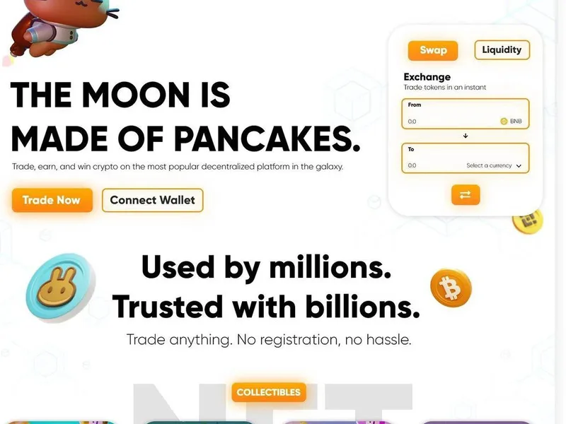
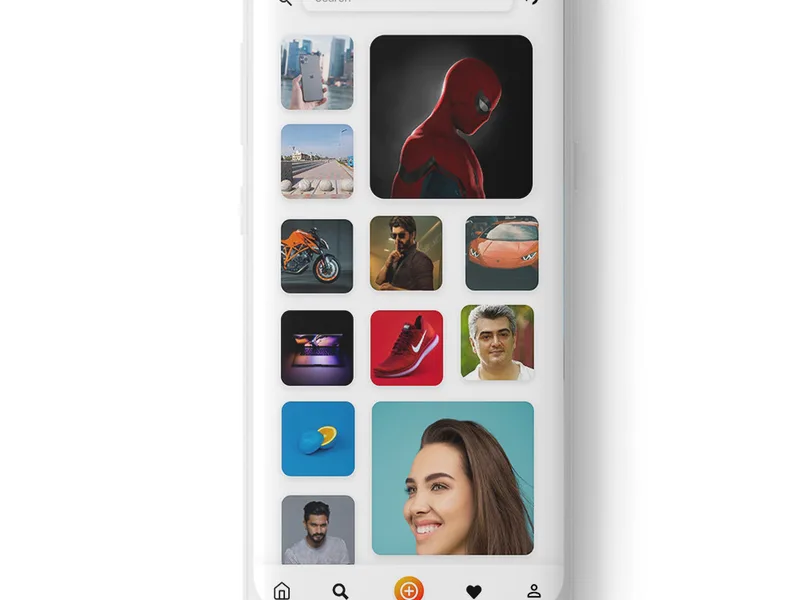
At We Define Net, we treat a design system for web projects as the single most influential asset a product team can invest in beyond the actual codebase itself. It is the blueprint that keeps every pixel, interaction, and decision consistent across screens, platforms, and team members, without forcing anyone to reinvent the wheel for each new page or feature. This guide walks through what modern web design systems look like in 2026, how to build one from the ground up, where most teams stumble, and why getting it right early pays compounding returns over the life of a product.
What a design system actually is (and is not)
A design system for web is a structured collection of reusable components, clearly documented standards, and shared principles that guide how a product looks, behaves, and grows. Think of it as a living style guide that extends far beyond static brand guidelines. Where brand guidelines tell you which logo to use and what the primary hex color is, a design system tells you exactly how that color functions across every button variant, error state, disabled input, and dark-mode palette, and it delivers those values in a format developers can consume directly inside a code repository.
It is not simply a component library, though a component library is one of its most visible outputs. It is not a pattern library sitting in a PDF nobody maintains, though that is a common starting point. It is also not a rigid cage that kills creativity. The best systems we have built at We Define Net leave room for designers and developers to solve novel problems while keeping the connective tissue, typography scale, spacing rhythm, interaction patterns, intact across the product. When teams conflate a design system with a component library or a one-time brand guide, they set themselves up for the maintenance problems that plague so many otherwise strong products.
How web design systems evolved into what they are today
The earliest style guides were printed brand books: logo clear-space rules, Pantone swatches, and typography pairings locked in a PDF. When the web arrived, teams printed those rules into CSS files. Then came pattern libraries, collections of reusable UI snippets hosted on a page designers could reference. Around the mid-2010s, major technology companies began open-sourcing the systems they had built for their own products: IBM released Carbon, Google put Material Design into the world, and Shopify contributed Polaris. Each demonstrated that a well-built system could serve thousands of internal contributors and external developers simultaneously.
The shift that matters for 2026 is that design systems have moved from a design-team deliverable to a cross-functional product infrastructure concern. Modern systems include not just visual tokens and components but also accessibility checkpoints, localization patterns, performance budgets, and API-driven theming. Teams at We Define Net see this evolution firsthand: clients who once asked for “a homepage design” now arrive asking for a scalable system that their internal teams can extend without constantly returning to an agency. That shift in expectation is healthy, it means the investment pays off over years rather than sprints.
The four principles that hold a strong system together
Every design system worth maintaining rests on a small set of foundational principles. The first is consistency over cleverness. When a designer creates a bespoke button for a single promotion banner, that exception ripples into QA, localization, accessibility audits, and the next sprint when someone else needs the same button. Consistency does not mean every page looks identical; it means the rules governing when variation is allowed are explicit.
The second principle is composability. Components should be designed to combine, a card component that works inside a grid, inside a modal, and inside an email template without requiring redesign. When components are composable, the system scales horizontally: each new component slots into existing patterns rather than demanding its own bespoke arrangement.
The third principle is documentation as a first-class deliverable. A component without usage rules, edge cases, and code examples is a liability. Teams at our website development practice regularly encounter situations where a client’s existing component library had no documented props or variation rules, forcing every new developer to reverse-engineer the intent before touching a single line of code.
The fourth principle is shared ownership. A design system owned by one designer or one team will stagnate. The most resilient systems have a clearly identified maintainer or core team, a contribution process for teams outside that core, and a public roadmap. When contributors know how to propose changes and understand the review cadence, the system evolves with the product instead of becoming a bottleneck.
The anatomy of a modern web design system
Understanding what belongs inside a design system helps teams avoid both the minimalist mistake (a color palette and nothing else) and the maximalist trap (documenting everything before a single component ships). A functional system organized around the needs of both designers and developers typically includes several layers that build on each other.
Design tokens
Tokens are the atomic values that define the visual language: color primitives (blue-500, neutral-100), spacing units (space-4, space-8), typography scales (text-sm, heading-lg), elevation values, motion durations, and border radiuses. When tokens are stored in a platform-agnostic format, often a JSON or YAML file, they can be transformed into CSS custom properties, iOS color sets, Android XML, and design-tool variables simultaneously. This single source of truth is what prevents the “the designer shows one shade of blue and the developer ships another” problem from recurring sprint after sprint.
Component library
Components are the assembled building blocks: buttons, form inputs, navigation bars, modals, cards, tables, toast notifications, and pagination controls. Each component should define its visual states (default, hover, focus, disabled, loading, error), its content slots, its responsive behavior, and its accessibility requirements. In 2026, most production-grade systems ship components in multiple frameworks, a React version, a vanilla HTML version, and sometimes a Web Components version, because clients and product teams rarely standardize on a single framework across all their properties.
Pattern documentation
Patterns sit above individual components and describe how to solve common product scenarios: a search bar that combines an input field, a submit button, and an autocomplete dropdown; a settings page that groups related form fields; an onboarding flow that sequences modals and progress indicators. Documenting patterns prevents teams from re-solving the same layout and interaction problems every time they build a new feature area.
Governance model
No discussion of system anatomy is complete without covering governance: who proposes changes, how proposals are reviewed, what the deprecation process looks like for components that are being replaced, and how versioning communicates breaking changes to consuming teams. A system without governance will drift. A system with overly restrictive governance will be ignored. The right balance depends on team size, but every system needs explicit rules on this front.
Design tokens versus component libraries: a comparison
Teams often ask whether they should prioritize building tokens first or jump straight to components. The honest answer is both, but they serve different purposes and require different maintenance rhythms. The table below breaks down the practical differences.
| Dimension | Design Tokens | Component Library |
|---|---|---|
| What it is | Named, platform-agnostic variables representing visual decisions | Assembled, interactive UI building blocks built from tokens |
| Granularity | Atomic, a single value per token | Molecular to organism-level, composed of multiple tokens |
| Primary audience | Designers and developers equally, via a shared language | Developers primarily, with design review for visual fidelity |
| Maintenance frequency | Low once stable, changed only when the brand or design language shifts | Ongoing, new variants, bug fixes, accessibility improvements, framework updates |
| Typical tooling | Style Dictionary, Theo, Figma Variables API | Storybook, Chromatic, React/Vue/Web Components libraries |
| Impact of a breaking change | High, changes ripple across every component and every product surface | Moderate to low, often isolated to the affected component |
| Where it fits in a project timeline | Establishes in the discovery or design-tokenization phase | Develops iteratively alongside the product, starting with high-frequency components |
In practice, the teams that ship the fastest do both in parallel. Tokens are defined early so that components have stable values to reference, and components are built incrementally, starting with the highest-traffic, highest-reuse elements like buttons, form fields, and navigation, rather than trying to spec out every possible component before writing production code.
Building a design system from scratch: a practical roadmap
The temptation when starting a design system is to begin with the fun part: choosing a component library, designing a beautiful documentation site, and picking the right tools. The teams that succeed invest serious time in the unglamorous groundwork before touching either. The first step is a brand strategy and design-language audit: what colors, typefaces, spacing habits, and interaction patterns already exist across the product? What is consistent by accident, and what is consistent by design? That audit produces the initial token map, the skeleton everything else hangs on.
With tokens mapped, the next phase is component prioritization. Not every component needs to ship on day one. The highest-value starting set typically includes buttons, inputs, headings and body text styles, cards, alerts, and navigation. These are the components that appear on the majority of pages and whose inconsistency is most visible to users. After the core set ships, teams should maintain a prioritized backlog of additional components and patterns, reviewed and refined every quarter.
Simultaneously, the documentation site should be treated as a product in its own right. It needs a way for contributors to propose changes, a changelog that communicates breaking updates clearly, and accessibility notes for every component. Many teams start with Storybook, which has become the de facto standard for component documentation because it renders each component in isolation, supports multiple frameworks, and integrates with visual regression testing tools. But Storybook is a means, not an end, what matters is that the documentation site is maintained, searchable, and kept in sync with what is actually shipping to production.
The final phase is rollout. A design system launched abruptly to all product teams at once typically generates resistance. A phased rollout, starting with a pilot team, incorporating their feedback, and then expanding, gives the system credibility and surfaces real-world problems before they affect every product area. Internal advocacy matters here: a champion on each product team who understands the system’s value and can help their colleagues adopt it smoothly will accomplish more than any amount of top-down mandate.
Accessibility as a built-in requirement, not an afterthought
An accessible design system is one where the accessible path is also the default path. Every component should meet Web Content Accessibility Guidelines standards, proper color contrast ratios, keyboard navigability, screen-reader labeling, and focus management, without requiring the developer using that component to know the details of those standards. When accessibility is baked into the component itself, it scales automatically. When it is left to individual developers to implement per project, it is implemented inconsistently at best and not at all at worst.
Practical steps to make this real include building each component with accessibility in mind from the first wireframe, testing components with assistive technology during the build rather than as a final QA step, and including accessibility notes in every component’s documentation page. Note the keyboard interaction model, required ARIA roles, expected screen-reader output, and any known limitations. Also consider integrating automated accessibility checks into the CI/CD pipeline so that regressions are caught before they ship.
Beyond compliance, accessible components tend to be better components overall. A button with a clear focus state, proper contrast, and a descriptive label is easier for every user to interact with, not just users relying on assistive technology. The discipline required to build accessibly produces higher-quality interfaces across the board.
Performance considerations for design system implementations
A design system that ships a hundred components but pulls in a hundred kilobytes of unused CSS and JavaScript on every page has solved the consistency problem while creating a new performance problem. The teams that build systems thoughtfully think about bundle impact from the start.
One effective approach is tree-shakeable component exports: each component is published as a separate entry point so that consuming applications import only what they use. If a page needs a button and nothing else, it should pull in the button CSS and JavaScript, not the entire design system bundle. Tools like CSS Modules, CSS-in-JS with static extraction, and native CSS layers all support this kind of granular consumption when the system is structured for it from the beginning.
Token-level optimization matters too. If a product uses twenty tokens but the compiled stylesheet includes two hundred, the unused tokens still contribute to bundle size and parsing time. Linting tools can flag unused tokens, and build pipelines can generate optimized token bundles per application. These optimizations are not glamorous, but they compound. A system that ships efficiently makes every product that uses it faster, and performance remains one of the strongest signals for user satisfaction and search visibility.
Measuring whether your design system is working
It is easy to measure output, how many components exist, how often the documentation site is visited, how many pull requests have been merged. It is harder but more meaningful to measure impact. The questions worth tracking include: how long does it take a new team member to build a standard page using the system versus building from scratch? How consistent are the components across the live product when audited visually? How many accessibility violations are found in components built with the system compared to custom-built components? How often do consuming teams report bugs in system components?
Surveys of designers and developers using the system provide another signal. Are teams requesting new components at a predictable rate, or are they building workarounds because the system does not cover their needs? Workarounds are a useful diagnostic: they tell you where the system has gaps. Track them, prioritize them, and close the gaps before workarounds become entrenched patterns that the system now has to undo.
None of these metrics require sophisticated tooling to start. A quarterly five-minute survey, a visual consistency audit every six months, and a shared backlog of system improvement requests give a small team enough signal to iterate intelligently without drowning in analytics.
Common pitfalls and how to avoid them
After working with design systems across a range of industries and team sizes, a few failure patterns show up consistently. The first is building too much too fast, spec’ing out hundreds of components before any product team has tested them in real usage. Most of those early components will need to be redesigned once they encounter real content, real edge cases, and real localization requirements. Start with the components you actually need right now and let the system grow from demonstrated demand.
The second pitfall is treating the system as a finished product. Design systems need maintenance budgets just like any other product: someone’s time allocated to reviewing contributions, updating dependencies, deprecating old components, and communicating changes. Teams that launch a system and then return to client work full-time will find that the system falls out of sync with the product within a few quarters.
The third pitfall is letting the design and development sides drift apart. When designers work in one tool and developers work in another, the system starts producing two versions of every component: the version the designer has in their file and the version the developer has in code. Tools that sync design tokens between Figma and code repositories help, but the real fix is a regular cadence where designers and developers review components together, not just at the start of a project but continuously as the system evolves. When content, graphic design, and engineering all feed into the same system on a shared timeline, the output stays coherent.
Frequently asked questions
Do I need a design system if my product only has ten pages?
Not necessarily. If your product is small, unlikely to grow significantly, and maintained by a single team that communicates well, a lightweight style guide may be sufficient. A full design system pays for itself when a product is growing across multiple teams, platforms, or properties, situations where the cost of inconsistency compounds quickly. The right time to invest is usually when you can see that the next twelve months will add more pages, more contributors, or more product surfaces than the current informal process can handle cleanly.
Should we build our own design system or adopt an existing one like Material UI or Shadcn?
Adopting an existing system can accelerate early delivery dramatically, especially for internal tools, prototypes, or products where brand differentiation is not a competitive priority. But adopting a system you do not own creates a dependency on that system’s roadmap, its visual language, and its maintenance practices. For consumer-facing products where the interface is part of the brand experience, building a custom system, or significantly customizing an adopted one, is usually worth the investment. The best approach at many organizations is a hybrid: adopt the patterns and tooling from an established system while building a custom token layer and component set on top that reflects the brand.
How do we get buy-in from stakeholders who see a design system as overhead?
The most persuasive argument is speed. Show how a new page built with existing system components ships in a fraction of the time of a custom-built page. Show how bug fixes and visual updates propagate across the entire product from a single source instead of requiring manual edits on dozens of pages. If your stakeholders care about development velocity, maintenance cost, or brand consistency, and most do, frame the design system as infrastructure that reduces all three. A practical early win, like re-skinning the product for a seasonal campaign using tokens instead of manual CSS edits, often does more to convince stakeholders than any argument or presentation.
What is the difference between a design system and a style guide?
A style guide is typically a static document that records design decisions: logo usage, color codes, typeface pairings, and do-and-don’t examples. A design system is a dynamic, code-connected infrastructure that includes those decisions plus interactive components, design tokens synced to code, pattern documentation, and governance processes. A style guide tells you what the brand looks like. A design system gives you the tools to build consistently with that brand at any scale. Most mature design systems include a style guide as part of their documentation, but a style guide alone is not a design system.
How do we handle a design system across multiple brands or sub-brands?
Multi-brand systems are increasingly common as organizations operate several related products or regional variations. The standard approach is a shared core, the structural tokens and components that stay constant across brands, wrapped in brand-specific themes that override the token values for color, typography, and imagery. The structural layer handles layout, interaction patterns, spacing, and component behavior. The theme layer handles visual identity. When done well, a new brand can be launched by defining a new theme in a token file rather than rebuilding every component from scratch. The blog at We Define Net covers case studies on multi-brand system architecture in more depth.
What tools do we actually need to get started?
The minimum viable toolkit includes: a design tool that supports shared variables (Figma is the current standard), a token transformation tool (Style Dictionary is the most widely used open-source option), a documentation and development environment (Storybook covers this for most teams), and a version control system (Git, hosted on a platform like GitHub or GitLab). Everything beyond that, visual regression testing, contribution portals, automated accessibility audits, is valuable but not required on day one. Start with the four essentials, build the habit of maintaining the system, and add tooling as the team and product grow into the need for it.
Ready to build a system that scales with your product
A well-built design system for web projects does not just make your product look consistent, it makes your team faster, your codebase healthier, and your brand more coherent across every touchpoint. At We Define Net, we have guided organizations through every stage of the process, from the initial token audit and brand alignment through to a production-ready component library and documentation site that their internal teams maintain independently. Whether you are starting from a scattered collection of CSS files or rebuilding an existing system that has outgrown its original team, the investment in structured, documented, accessible design infrastructure pays for itself quickly and compounds over time. Reach out to us at https://wedefinenet.com/contact/ or email info@wedefinenet.com to discuss your project, or call us at +91 63824 32453 or +91 63816 32453.
At We Define Net, we build design systems that give your product and your team room to grow. Talk to us at info@wedefinenet.com, call +91 63824 32453 or +91 63816 32453, or visit https://wedefinenet.com/contact/ to start the conversation.