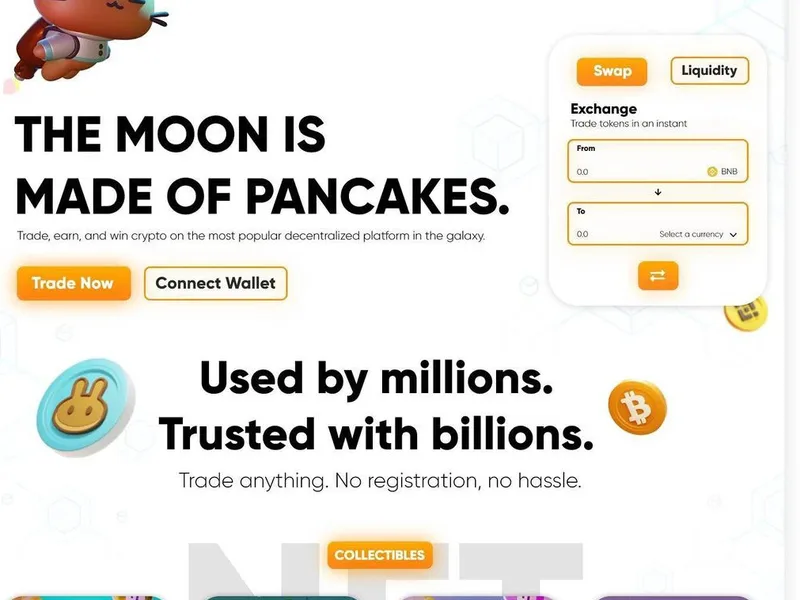
Building a successful financial technology product starts long before the first pixel is placed. The way users experience your app shapes whether they complete a transaction, return for a second session, or delete the app within minutes. For fintech startups, the stakes run higher than in most categories: users are trusting you with their money, their financial history, and their sense of security. A poorly designed interface can quietly undermine that trust regardless of how strong your underlying technology is. In this guide, we walk through every layer of app UX design for fintech startups, from regulatory constraints and onboarding flows to data visualization, biometric authentication, and the common mistakes that sink otherwise promising products.
Why fintech app UX is fundamentally different
Every app demands a good user experience, but fintech applications carry a combination of pressures that few other categories match. Users approach financial tools with heightened anxiety about security, and they tolerate friction poorly because they use these apps during moments when they need clarity rather than confusion. At the same time, financial products involve real money, regulatory obligations, and consequences for errors that a weather app or a social network does not carry. This means that app UX design for fintech startups must balance competing demands: it must feel welcoming to newcomers, remain rigorous enough for experienced users, and communicate trustworthiness at every level without resorting to cluttered interfaces that bury the actions users actually want to take.
Fintech startups also face a practical constraint that consumer lifestyle apps rarely encounter: the need to express trust through design before users have any brand familiarity with you. An established bank can lean on years of reputation. A startup launching its first mobile banking or investment app has no such credibility reservoir. Every design decision, from the color palette to the spacing between buttons, contributes to that first impression. Users form judgments about an app’s legitimacy within the first few seconds of interaction, which means the opening screens, login flow, and dashboard layout all carry disproportionate weight in how the product is perceived.
The core principles that guide great fintech app UX
Before diving into specific features and screens, it helps to establish the foundational principles that should inform every decision in app UX design for fintech startups. The first is clarity over cleverness. A visually stunning onboarding animation that fails to explain what the app actually does is not a good onboarding animation. Users open a fintech app with a task in mind, and the interface should help them complete that task with as little mental load as possible. Every extra element that does not serve the user’s immediate goal is a potential source of confusion.
The second principle is progressive disclosure. Fintech applications often need to support a wide range of features over time, but bombarding users with every option on day one is counterproductive. Show users what they need right now, and reveal additional capabilities as their familiarity and needs grow. The third principle is consistent vocabulary. Financial terminology varies across products, and users may arrive with mental models built from competing apps. Establishing a clear, consistent naming system for actions, screens, and account categories reduces cognitive friction and makes the product easier to learn.
The fourth principle is error tolerance and recovery. In financial products, mistakes carry real consequences. An interface that prevents errors through smart defaults and confirmations is good. An interface that makes it easy to undo or correct an error when one slips through is even better. Users should never feel trapped by a screen they filled out incorrectly, and the path back to a correct state should be obvious.
Onboarding: where first impressions become trust
The onboarding sequence is the most critical stretch of the entire user journey for a fintech startup. This is the moment when users who may have downloaded the app out of curiosity decide whether it earns a permanent place on their device. A well-structured onboarding does three things: it explains what the app does in plain language, it demonstrates value quickly, and it sets expectations for what happens next.
The most common onboarding mistake is asking for too much information before the user has experienced any value. Requiring a full KYC verification, a bank account link, and a detailed profile setup before the user has seen the product dashboard is asking for a leap of faith that most users are not willing to give. A better approach is to let users enter the app with minimal initial data, show them a functional preview or demo environment, and then gradually request the information needed to unlock full functionality at moments when the user can see exactly why that information is needed.
Progress indicators matter in onboarding, especially for processes that involve waiting. Whether a user is waiting for identity verification, a bank connection to complete, or a document to scan, the interface should communicate where they are in the process and how long they can expect to wait. A user left staring at a loading spinner with no context is a user who will start questioning whether the app works at all. If you need support building onboarding flows that convert, our app development team has experience designing first-run experiences for complex financial products.
Navigating regulatory and compliance UX challenges
Fintech applications do not operate in a design vacuum. They exist within regulatory frameworks that mandate specific disclosures, consent flows, and verification steps. These requirements can feel like the enemy of good UX, but the best designers treat them as constraints that demand creativity rather than reasons to abandon user-centered thinking.
The KYC onboarding flow illustrates this tension well. Regulators require identity verification, and in many markets the process involves document upload, selfie capture, and sometimes in-person verification. Users understand that these steps exist for legitimate reasons, but they still find them tedious and intrusive. The UX solution is not to skip required steps, but to frame them transparently: explain why each piece of information is needed, show how the data will be used and protected, and reassure users at each stage that they are on a verified, regulated path. When compliance steps are presented with transparency and context, users complete them at higher rates and with less frustration than when the same steps appear as unexplained roadblocks.
Disclosure requirements for fees, interest rates, and risk warnings present a different kind of UX challenge. Financial regulators often require specific language and formatting for disclosures, and that language is rarely written in plain, approachable terms. Rather than dumping a wall of legal text into the interface, consider using layered disclosures: a concise summary upfront with an expandable section for the full regulatory text. This approach respects the regulatory requirement while keeping the primary user experience clean and readable. For broader context on building brand trust through consistent messaging, our brand strategy service addresses how to align compliance requirements with your brand voice.
Security features that reassure without frustrating
Security in a fintech app is both a technical requirement and a UX design challenge. Users need to feel that their data and money are protected, but security measures that feel excessive or arbitrary erode the very trust they are meant to build. The key is designing security interactions that are proportionate to the risk and contextual to the user’s current activity.
Biometric authentication has become a standard expectation in fintech apps, and for good reason. A fingerprint or face recognition login is faster than typing a password and feels less intrusive because it uses a physical characteristic the user already possesses. The UX consideration here is fallback behavior: when biometric authentication fails or is unavailable, the transition to an alternative login method should be smooth, and the user should never be locked out of their account without a clear path to recovery.
Transaction confirmation flows offer another opportunity to demonstrate security awareness without creating friction. A well-designed confirmation screen does more than ask “Are you sure?” It shows the user exactly what they are confirming: the amount, the recipient, the date, and any fees. This single screen can prevent more costly errors than any other element in the app. For transactions above a certain threshold, step-up authentication such as a PIN or biometric prompt adds a layer of protection that users understand and accept because it appears at the moment of highest risk.
Session management and automatic logout are UX decisions as much as security ones. Setting a session timeout that is too aggressive frustrates users who multitask or step away briefly. Setting it too loosely undermines security on shared devices. A thoughtful approach uses contextual signals: shorter timeouts on shared or public devices, longer ones on devices that appear to be the user’s personal phone, and clear notifications before a session expires so the user can extend it with a single tap.
Presenting financial data clearly and meaningfully
Financial data is inherently complex, and presenting it in a way that users can act on is one of the most difficult UX challenges in fintech. Account balances, transaction histories, portfolio allocations, and interest calculations all carry meaning that varies by user expertise. A novice investor and a seasoned trader will read the same portfolio screen very differently, and the interface needs to serve both without overwhelming either.
One effective approach is tiered information display. The primary view shows the most important numbers in clean, simple format. Users can drill down into more detail by tapping on individual elements, and a detailed view exposes additional metrics, historical trends, and contextual information. This pattern keeps the default view approachable while making depth available for users who want it. The visual hierarchy of financial data matters enormously: the largest numbers on the screen should be the ones users care about most at that moment, and supporting data should recede visually.
Chart and graph design deserves particular attention in fintech apps. Line charts for balance trends, pie charts for portfolio allocation, and bar charts for spending categories are all useful, but they can also mislead if the scales, labels, or time ranges are chosen carelessly. Always use clear axis labels, consistent time periods, and accessible color palettes that work for users with color vision deficiencies. Tooltips and touch targets on charts should be large enough to interact with on mobile screens, and users should be able to toggle between different time ranges without losing the context of what they were viewing.
Personalization adds another layer of complexity to financial data presentation. Users have different financial goals, different accounts they prioritize, and different types of transactions they monitor most closely. Allowing users to customize their dashboard layout, choose which account types appear prominently, and set spending category priorities makes the app feel tailored to their situation rather than a generic financial dashboard. This is where custom web and app development capabilities that support dynamic, user-configurable interfaces become important for startups that want to differentiate on personalization.
Embedding biometrics and AI into the fintech experience
Biometric authentication is the most visible AI-adjacent technology in fintech apps today, but it is only the beginning. Machine learning models are increasingly used for fraud detection, spending categorization, predictive balance alerts, and personalized financial recommendations. Each of these features adds intelligence to the app, but each also introduces UX considerations around transparency and user control.
When an app automatically categorizes a transaction, the user should be able to see how the categorization was determined and correct it if the model gets it wrong. When the app flags unusual activity, the explanation should be specific enough for the user to understand what triggered the alert. This is not just a UX preference: users who understand why the system is behaving a certain way are more likely to trust it and to cooperate with its requests for verification or additional information.
AI-powered features like personalized savings suggestions or investment recommendations should be presented with appropriate context about confidence levels and data sources. A recommendation generated from the user’s transaction history should be framed differently from one generated from broader market data, and users should always have the option to decline or adjust AI-suggested actions. The best fintech apps treat AI as an assistant that augments the user’s decision-making rather than a black box that makes decisions on the user’s behalf.
Common UX mistakes that kill fintech app adoption
Despite the best intentions, fintech startups consistently fall into a handful of predictable UX traps. Understanding these patterns can help your team avoid them during the design and development process.
The first mistake is overcomplicating the dashboard. First-time users opening a fintech app should see their most important information at a glance. When the default screen is cluttered with graphs, promotional banners, feature carousels, and navigation options competing for attention, users do not know where to look. The cure is ruthless prioritization: identify the three or four things the majority of users come to the app to see, and make those the dominant elements on the home screen.
The second mistake is hiding critical actions behind multiple taps. Checking a balance, making a transfer, or viewing a recent transaction should require as few steps as the product logic allows. Every unnecessary tap between the user and their goal is an opportunity for the user to abandon the task. Button placement should follow platform conventions, and the most frequently used actions should be reachable from the main screen without deep navigation.
The third mistake is failing to handle edge cases gracefully. Network failures, interrupted transactions, expired sessions, and incomplete data loads are not rare events in financial applications. Every one of these states should have a well-designed recovery path that communicates what happened, what the user can do about it, and what state their data is in. A user who sees an unhelpful error message during a money transfer is a user who will contact support and possibly abandon the app.
The fourth mistake is ignoring accessibility from the start. Financial applications serve a diverse user base that includes older adults, users with visual or motor impairments, and users who rely on screen readers. Designing for accessibility from the beginning is far more efficient than retrofitting it later, and it expands your potential user base significantly. This includes sufficient color contrast, scalable text, meaningful alt text for charts, and full support for platform-level accessibility features.
The fintech app development process: from design to launch
Good app UX design for fintech startups does not emerge fully formed in a single design sprint. It evolves through a structured process that moves from research through design, testing, development, and iterative improvement after launch.
User research in the fintech context needs to account for the sensitivity of the subject matter. Users may be hesitant to share detailed financial information in research interviews, and they may not accurately predict how they will use a financial product until they actually interact with it. Spending time with potential users in their natural environment, watching how they currently manage their finances, and understanding the pain points in their existing workflows produces insights that surveys and focus groups alone cannot capture.
Prototyping and usability testing are especially valuable in fintech because the domain involves workflows that users may be encountering for the first time. A prototype that users can interact with, even at low fidelity, reveals friction points, confusing terminology, and missing information that static mockups conceal. Usability testing with real users, including users with varying levels of financial literacy, should be a standard part of every iteration rather than a final gate before launch.
The development handoff from design to engineering requires careful attention to detail. Fintech interfaces contain many small elements that carry significant meaning: currency symbols, decimal precision, date formats, and color-coded status indicators. Each of these needs to be specified clearly in the design system and verified in the built product. A misplaced decimal or an ambiguous status color is not just a visual flaw in a fintech app; it can lead to user errors that have financial consequences.
Post-launch, the work of refining the UX continues. User behavior data, support tickets, app store reviews, and direct user feedback all provide signals about where the experience can be improved. Fintech products benefit from continuous refinement because user needs evolve as their financial situation changes, as new regulations are introduced, and as the competitive landscape shifts. Building a feedback loop into your product development cycle ensures that the app improves in the areas that matter most to real users.
Designing for trust and transparency
Trust is the currency of fintech, and every element of the user experience either builds or erodes it. Transparent communication is the most reliable trust-building tool available to designers. When a transaction is pending, the app should say so clearly rather than showing a confusing intermediate state. When a fee is charged, it should appear prominently with an explanation of what it covers. When an action cannot be completed, the user should understand why and what they can do to resolve it.
Consistency across the product reinforces trust by showing users that the system is predictable and reliable. If the same action appears in multiple places, it should look and behave the same way every time. If a user saves a preference in one section of the app, that preference should be reflected consistently in other sections. Inconsistencies create doubt about whether the system is working correctly, and doubt is toxic in a financial context.
The tone of microcopy throughout the app also contributes to trust. Error messages should be calm and helpful rather than alarming. Success confirmations should be clear and specific rather than generic. Loading states should provide information rather than leaving users wondering whether the app is working. In all of these moments, the language of the app is communicating something about the organization behind it, and that communication shapes the user’s willingness to engage more deeply over time.
Key elements every fintech startup app should have
Understanding which features matter most helps teams prioritize their design and development efforts effectively. The following table outlines the essential elements that appear in well-designed fintech applications, grouped by their role in the user experience.
| Category | Essential Element | UX Purpose |
|---|---|---|
| Authentication | Biometric login with fallback options | Fast, secure access without password fatigue |
| Authentication | Session timeout warnings with extend option | Balances security needs with user convenience |
| Authentication | Account recovery flow with clear steps | Prevents permanent lockout and reduces support burden |
| Dashboard | Customizable account summary view | Lets users prioritize the data they care about most |
| Dashboard | Quick-action buttons for frequent tasks | Reduces navigation steps for common operations |
| Transactions | Detailed transaction view with category and notes | Helps users understand and organize their spending |
| Transactions | Search and filter capabilities | Enables users to find specific transactions quickly |
| Transfers | Saved payee management | Speeds up recurring transactions |
| Transfers | Confirmation screen with full transaction details | Prevents errors and provides audit trail |
| Notifications | Customizable alert preferences | Prevents notification fatigue while keeping users informed |
| Notifications | In-app notification center with clear categorization | Centralizes important updates without relying on push alone |
| Support | In-app chat or help center with contextual help | Reduces abandonment when users encounter problems |
| Support | Quick access to transaction dispute or freeze options | Gives users control when something goes wrong |
This list is a starting point rather than a mandatory checklist. Every fintech product has a different feature set based on its category, regulatory environment, and target audience. The unifying theme across all of these elements is that they respect the user’s time, provide clear information at the moment it is needed, and give users agency over their financial interactions. If your product requires backend infrastructure to support these features reliably, exploring options through custom website development can help ensure the technology layer matches the design ambitions of the front-end experience.
The role of SEO and discoverability for fintech apps
Great app UX design for fintech startups does not exist in isolation from the broader digital marketing ecosystem. Users need to discover your app before they can experience it, and the way your app appears in search results, app store listings, and review sites shapes the expectations users bring to the first interaction. A consistent brand presence across digital touchpoints reinforces the trust signals that your app’s UX is designed to communicate. If you are building your digital visibility alongside your product, our SEO service covers the strategies that help fintech brands earn organic visibility in competitive search landscapes.
Building a design system that scales with your product
As a fintech startup grows from a single product into a platform, the demand for consistency across screens, features, and even product lines increases. A well-structured design system addresses this by codifying the visual language, interaction patterns, and component library that your team uses to build the app. For fintech products, design systems carry an additional responsibility: they ensure that security-related elements like confirmation dialogs, error states, and data displays are implemented consistently across the product, reducing the risk of an inconsistent implementation undermining user trust in a critical flow.
Design systems also accelerate the development process. When designers and engineers share a common vocabulary of components, the handoff between design and development becomes smoother, and the time from concept to production decreases. For startups operating with lean teams, this efficiency gain is significant. It means that new features can be designed, built, and tested faster, which in turn means the product can respond to user feedback and market changes more quickly.
The content strategy within a fintech app deserves its own systematic approach. The labels, headings, error messages, help text, and legal disclosures that appear throughout the product should be governed by a content style guide that addresses tone, terminology, and formatting conventions. Consistent content reinforces the perception of a well-engineered, trustworthy product. Inconsistent or contradictory language across different parts of the app creates doubt about the product’s quality and the organization behind it. This level of consistency is also the foundation for strong brand recognition across every channel, which is why brand strategy and product design should be developed in parallel rather than sequentially.
Testing and iterating your fintech app UX
The launch of a fintech app is a beginning rather than an endpoint for UX design. Real user behavior after launch will reveal patterns, problems, and opportunities that no amount of pre-launch research could have predicted. Building a systematic approach to post-launch UX improvement ensures that the app continues to serve users well as the product and its user base evolve.
Quantitative analytics provide one source of insight. Funnel analysis reveals where users drop off in critical flows like onboarding, account setup, and money transfers. Session recordings and heatmaps show which interface elements users engage with and which they ignore. Feature adoption rates indicate which capabilities are finding traction and which are going unused. Each of these signals points to specific areas where the UX can be refined.
Qualitative feedback complements quantitative data by explaining the why behind the patterns. User interviews, support ticket analysis, and app store reviews all contain valuable information about how users perceive the product and where they encounter friction. A recurring complaint about a specific screen or feature in support tickets is a clear signal that the UX needs attention in that area, even if the analytics show that most users are completing the flow successfully.
A/B testing is a powerful tool for fintech UX improvement because it allows teams to compare alternative designs with real users and measure the impact on concrete outcomes like task completion rates, error rates, and conversion. However, A/B testing in fintech requires care. Tests that involve financial decisions carry higher stakes than tests on a content site, and changes that improve a metric like sign-up rate could simultaneously increase the rate of user confusion or error downstream. Always test changes in context and measure their full-funnel impact rather than optimizing for a single intermediate metric.
Frequently asked questions
What makes app UX design for fintech startups different from other app categories?
Fintech applications combine high user expectations for security and trust with complex financial workflows that many users find intimidating. Unlike entertainment or social apps, fintech products involve real money and real consequences for errors, which means every interface decision carries more weight. Users approach fintech apps with a problem-solving mindset rather than a leisure mindset, and they have little patience for confusing layouts, slow performance, or unclear communication. The regulatory environment also imposes design constraints that most other app categories do not face, requiring designers to balance compliance obligations with user experience quality.
How should a fintech startup approach onboarding flow design?
Effective onboarding in fintech balances two competing needs: collecting the information required to operate the product and demonstrating value quickly enough to earn the user’s continued attention. Rather than front-loading every required verification step, consider a progressive approach where users enter the app with minimal initial setup, experience a functional preview of the core value proposition, and then complete additional setup at moments when the benefit is clear. Each step of the onboarding flow should explain why the requested information is needed, and progress indicators should keep users informed about where they are in the process and how long remaining steps are likely to take.
What security features are essential in a fintech app’s UX design?
The essential security features in a fintech app include biometric authentication as the primary login method with reliable fallback options, transaction confirmation screens that display full details before execution, contextual authentication prompts that appear at moments of high risk, and clear session management with warnings before automatic logout. Beyond these technical features, the UX must communicate security awareness through design choices: consistent visual treatment of sensitive information, clear labeling of verification steps, and transparent communication about data handling practices. Users who understand and can see the security measures in place are more likely to trust the app with their financial information.
How do regulatory requirements affect fintech app UX design?
Regulatory requirements affect fintech UX most visibly in KYC onboarding flows, fee disclosures, risk warnings, and consent management. Rather than treating these as nuisances that degrade the user experience, the best approach is to design compliance steps with the same user-centered thinking applied to other parts of the product. Explain why each piece of information is needed, use layered disclosures that provide a summary upfront with detailed legal text available on request, and design consent flows that are genuinely informative rather than designed to be clicked through without reading. Users who understand the purpose of compliance steps complete them more willingly and develop more trust in the product overall.
What are the most common UX mistakes in fintech app design?
The most common UX mistakes in fintech include overloading the dashboard with too many competing elements, hiding critical actions behind excessive navigation steps, failing to design graceful error recovery paths, and neglecting accessibility from the early design stages. Dashboard clutter prevents users from finding what they need quickly, which is especially damaging in a product where users often open the app with a specific task in mind. Hidden actions increase task completion time and frustration. Poor error handling leaves users feeling trapped or uncertain about their transaction status. And accessibility oversights exclude users who could benefit significantly from the product. Each of these mistakes is avoidable with disciplined user research and iterative testing throughout the design process.
How should fintech startups approach ongoing UX improvement after launch?
Ongoing UX improvement should combine quantitative analytics with qualitative user feedback. Analytics reveal where users drop off in key flows and which features they use most or ignore entirely. User feedback from support interactions, reviews, and interviews explains the reasons behind those patterns. A/B testing allows teams to validate design changes with real user data, though it should be applied carefully in financial contexts where changes can have downstream effects on user behavior and error rates. The most effective post-launch UX programs establish regular review cycles, prioritize improvements based on user impact rather than ease of implementation, and maintain an open channel for users to report friction they encounter.
Conclusion
App UX design for fintech startups sits at the intersection of user experience craft, financial domain knowledge, and regulatory awareness. Getting it right requires understanding that every screen, every button, and every word in your app contributes to the user’s perception of whether your product is safe, competent, and worthy of trust. The startups that succeed in this space are the ones that treat UX not as a final polish layer applied before launch but as a continuous discipline that shapes the product from its earliest concept through years of iteration after it reaches users.
The investment in thoughtful UX design pays compounding returns. Each well-designed interaction builds trust that carries over to the next interaction. Each clear disclosure reduces anxiety that would otherwise cause users to abandon the product. Each moment where the app saves a user time or prevents an error reinforces the user’s decision to choose your product over alternatives. In a competitive market where fintech startups are vying for users who are naturally cautious about handing over control of their finances, the quality of your app’s user experience is one of the most powerful differentiation tools available.
If you are building a fintech product and want to discuss how thoughtful app UX design for fintech startups can strengthen your user acquisition and retention, reach out to the team at We Define Net. We are a full-service digital agency based in Chennai, India, working with clients internationally across SEO, paid advertising, social media, app and web development, and brand strategy. Email us at info@wedefinenet.com or call +91 63824 32453 / +91 63816 32453. You can also reach us directly through our contact page.